"Shipped App 🚀"
XR Onboarding & Logo Design
Client: Ping Pong Club - How might we engage users to understand and accept usage of private hand tracking data?

The Problem
Client Needs: Nobody wants to engage with a boring permission card, but it is necessary users know what we need from them
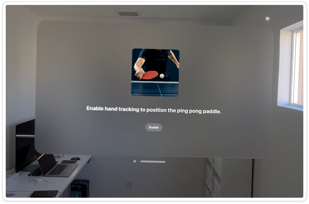
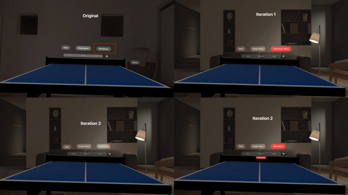
This is the original onboarding screen ^
Constraints:
1. I don't own an Apple Vision Pro so I couldn't research first hand how the onboarding currently was.
2. App does not have a Design system in place or clear Design Strategy.
3. Must be easy for developer to deploy design in one day.
The Solution
Solution is engaging design with color along with brand placement of the Ping Pong Club logo, ready to ship right away!
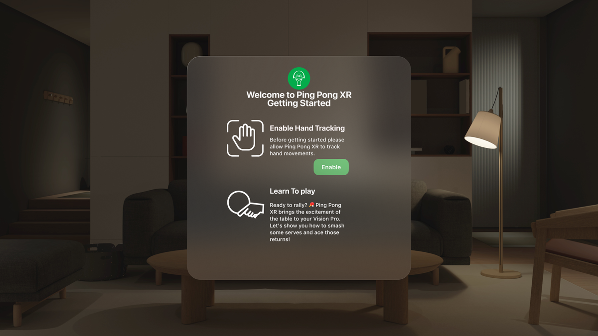
This enabled a clear call to action to the user while giving them what they needed to know.
- • Figma
- • Vision OS 2 UI Kit
Design Process & Strategy
Research
I had to understand the app more & the users. So I went to the App Store, media articles, Reddit, YouTube, X and the creator of the game to get as much insights as possible.
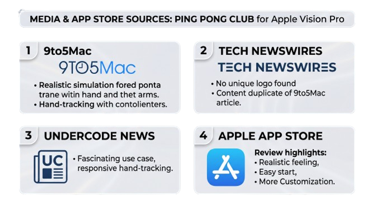
Then I categorize Negative & Positive Feedback to inform the design.
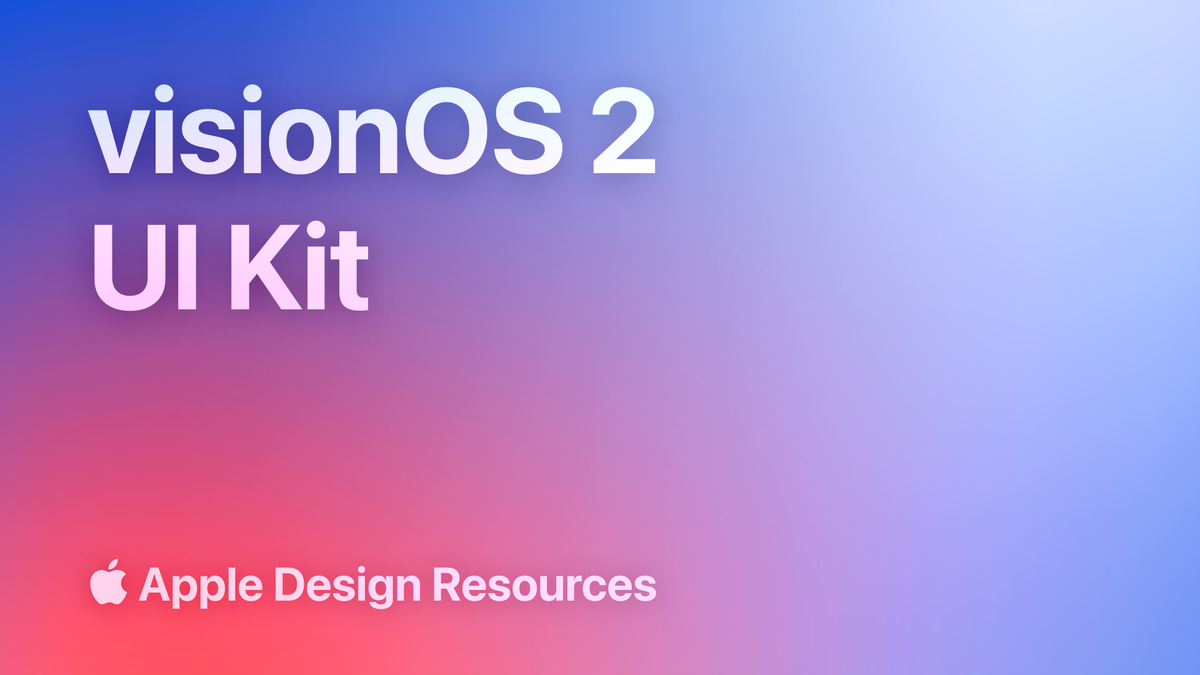
Find an easy to use Design System
That was simple, Apple has a design library that was published in Figma and design tokens that translate the UI into code seamlessly.
Iteration
Client wanted more designs from me like logos, more onboarding and beta feature notifications. So I provided!
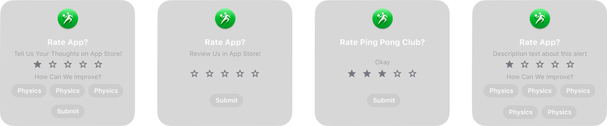
We need users to give more feedback from in the app, so a rating screen linking to the App store review page was designed:
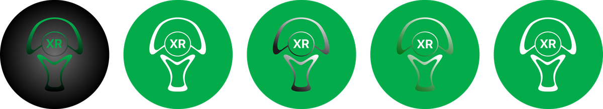
I made various logo ideations for the client to review:
I also ideated ideas to indicate a beta feature within the app:
Test & Ship!
I tested with users who said they were enjoying the onboarding and visual direction, they wanted more of this for ever feature in the app.
They also appreciated the fact that I was attempting to give the app more of a visual identity.
Next Steps!
1. Stakeholder management 😅, it was nice to practice being a design advocate when you are working with people who value the engineering more than the design.
2. Your designs may not last forever, teams change and so do product directions.
I wish I could have been involved in more design strategy to help ensure the app had a stable brand identity going forward.
The creator has decided to have the app be more focused on technical implementation and put design 2nd, so when they are ready to really bump up that engagement and user loyalty I am hoping to help.