Family Tree Map
How do you turn messy, half-remembered family history into a system you can see three different ways?
The Problem
A 3-day Systems class sprint asked one thing: visualize a family tree.
The real problem was the data. No records existed, so I had to build the dataset myself, and even then a lot of it was incomplete. How do you visualize something you only half know?
The Solution
Treat the data as the design material.
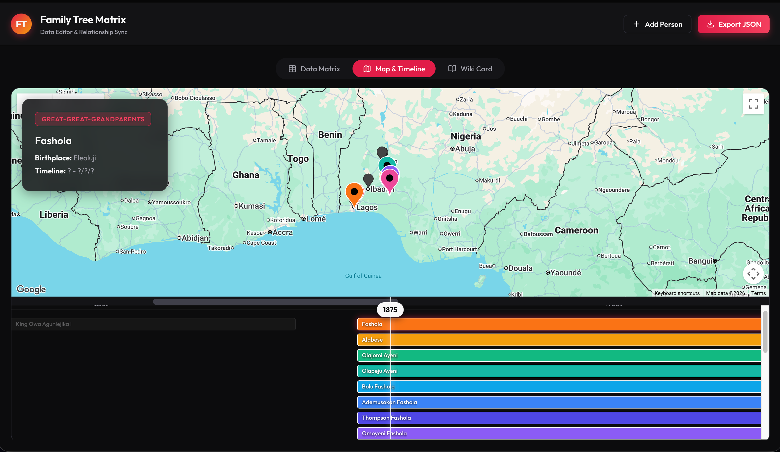
I structured and made the dataset editable first, then rendered it three ways from one consistent source: a map, a timeline, and a wiki. The map was never the hard part. The data was, so I got the model right before I built a single screen.
- • Google Maps API
- • FigJam
- • Antigravity IDE
- • Gemini
- • Material Design 3
Design Process & Strategy
Gather the material
I treat the interviews as data collection, not storytelling.
I called my mom and dad separately and mapped what they told me in FigJam.
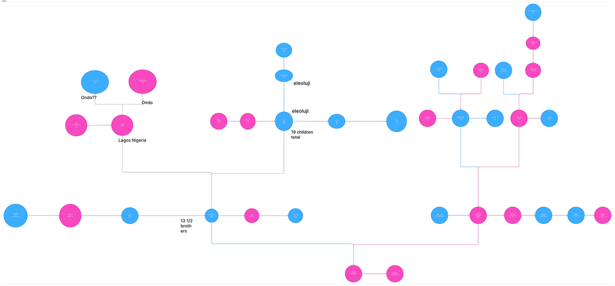
The encoding: color for gender, circle size for birth order (bigger is older), and a "?" or note anywhere data was missing or uncertain. Even for twins, I showed who came first.
Why it mattered: a lot was missing (dates, names, places), so the model had to tolerate gaps from the start.
Structure before visuals
Build an editable data matrix first, before the map.
I could have jumped straight to the fun part. I didn't, because accurate, editable data makes everything downstream easier.
The one-prompt win: I gave Gemini a photo of the combined tree and it built a clean, editable matrix. My family carries mythical African lore and royal titles, and I told it to capture those fields in the first prompt. It did.
Payoff: once the data was right, the data became a material I could shape any way I wanted.
Design system as input
Hand the AI a design system up front, for both the matrix and the map.
I chose Material Design 3, betting Gemini knew Google's own system well. It did, and it took some of the vibecoded edge off and gave the app a cohesive base.
Honestly: it still reads a little vibecoded (see what I'd change). But starting from Google's own system meant far less to clean up if scaled.
Principle: cohesion was a decision I made at the input, not a cleanup at the end.
Build the map and timeline
With sound data and a design system, the map and timeline came together fast on the Google Maps API. The model even inferred reasonable lifespans, capping most people near 80 despite “?/??/????” dates, because the structure gave it enough to reason with.
The bug: I couldn't scroll past 1988, but I could when I shrank the browser window. The engineer in me read that instantly: the scrollbar wasn't adapting to window width responsively.
Tradeoff: I tried to fix the logic in plain English. The AI kept proposing fixes that sounded right but didn't land, and couldn't locate the real cause. With 3 days and no dedicated engineer, I scoped to the working form factor for the presentation and moved on. With more time or an engineer, that is exactly where I'd have spent it.
The wiki, and anticipating failure
Put the title where it stands out.
The model first tucked the title under the profile card. A title belongs top and center, so I moved it.
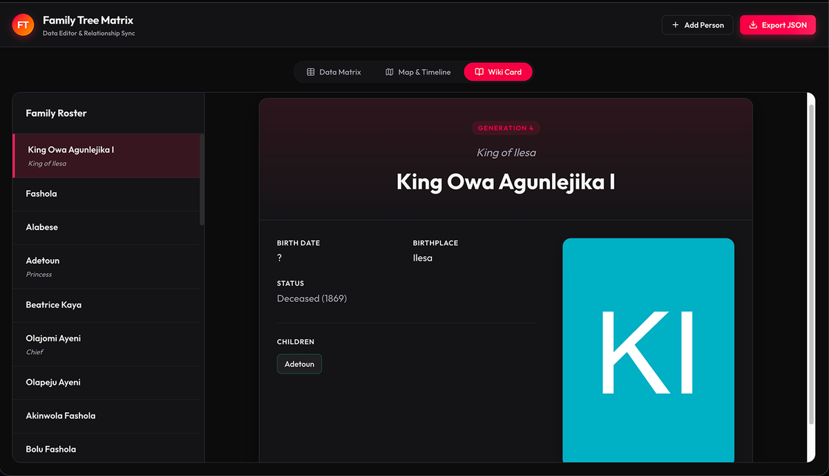
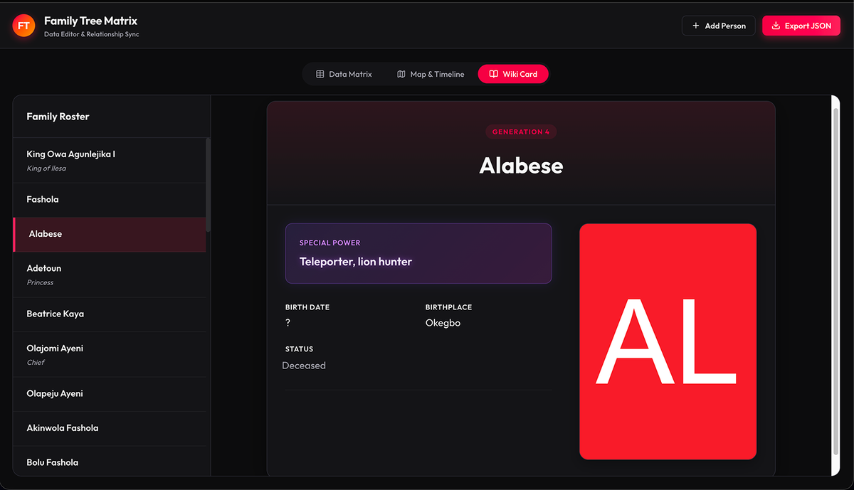
Foresight: expecting the model to fumble the logic again, I told it to show the title badge only for people who actually have a title. No title, no badge. It worked cleanly.
What this proved: my data organization was sound enough that I could manipulate it however I wanted, and it stayed consistent across every view.
Result
This is a 3-day class prototype, so there are no users or metrics yet.
But here is the proof the system held: I could hand my JSON dataset to my classmates' projects and it dropped in cleanly every time, no reformatting. One well-structured dataset also rendered as a map, a timeline, and a wiki, all consistent, with the AI reasoning correctly over incomplete data.
What I'd do differently
Fix the scroll properly: rebuild the components in Figma with auto layout so the layout is truly responsive at any form factor. There are tools that capture a vibecoded page into Figma, so I'd bring it in, rebuild it responsively, and the scroll would work at any window size, no engineer needed.
A real color system: test a palette to shed the default vibe-coded look, make the map pins intentional, and design a scalable color-assignment scheme for when the tree grows to hundreds of people across 10 generations.
Show incomplete data: design an affordance for missing info, like a timeline edge that fades instead of ending solid when dates are unknown.
What I learned
AI built the screens. Design decided what they showed.
My biggest lesson: in an AI workflow, your data is your design material. Organize it with intent and you can render it any way you need, consistently.
It is not about what you use. It is about how you structure what you feed it.