App Re-design
How might a digital queue feature reduce friction, confusion, and anxiety at public EV charging stations?
The Problem
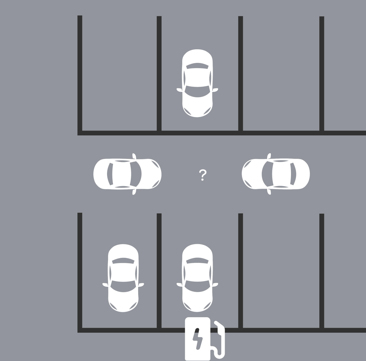
Can you prove who came first?
Neither can they...California will ban new gas-car sales in 2035 but public charging hasn't kept pace, and it's costing the industry its own customers.
Every single Electrify America customer I spoke to 8 out of 8 said they'd never buy another EV. Not because of the car. Because of public charging. I interviewed 16 EV drivers, split evenly between an Electrify America station and a Tesla station.
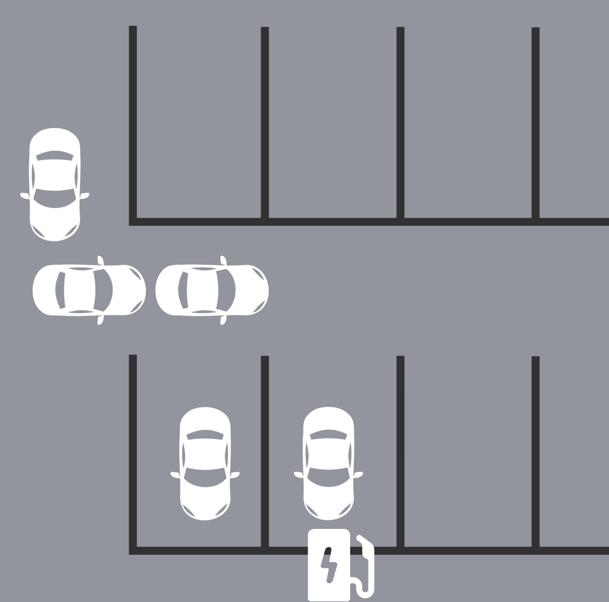
At EA stations,
- 😡 Drivers waited 1 to 4 hours with no way to hold their place and no way to prove who arrived first.
I had to scope hard , many of the problems were infrastructure related, outside my reach. So my question became: what can I fix with design alone, inside the existing EA app?
The Solution
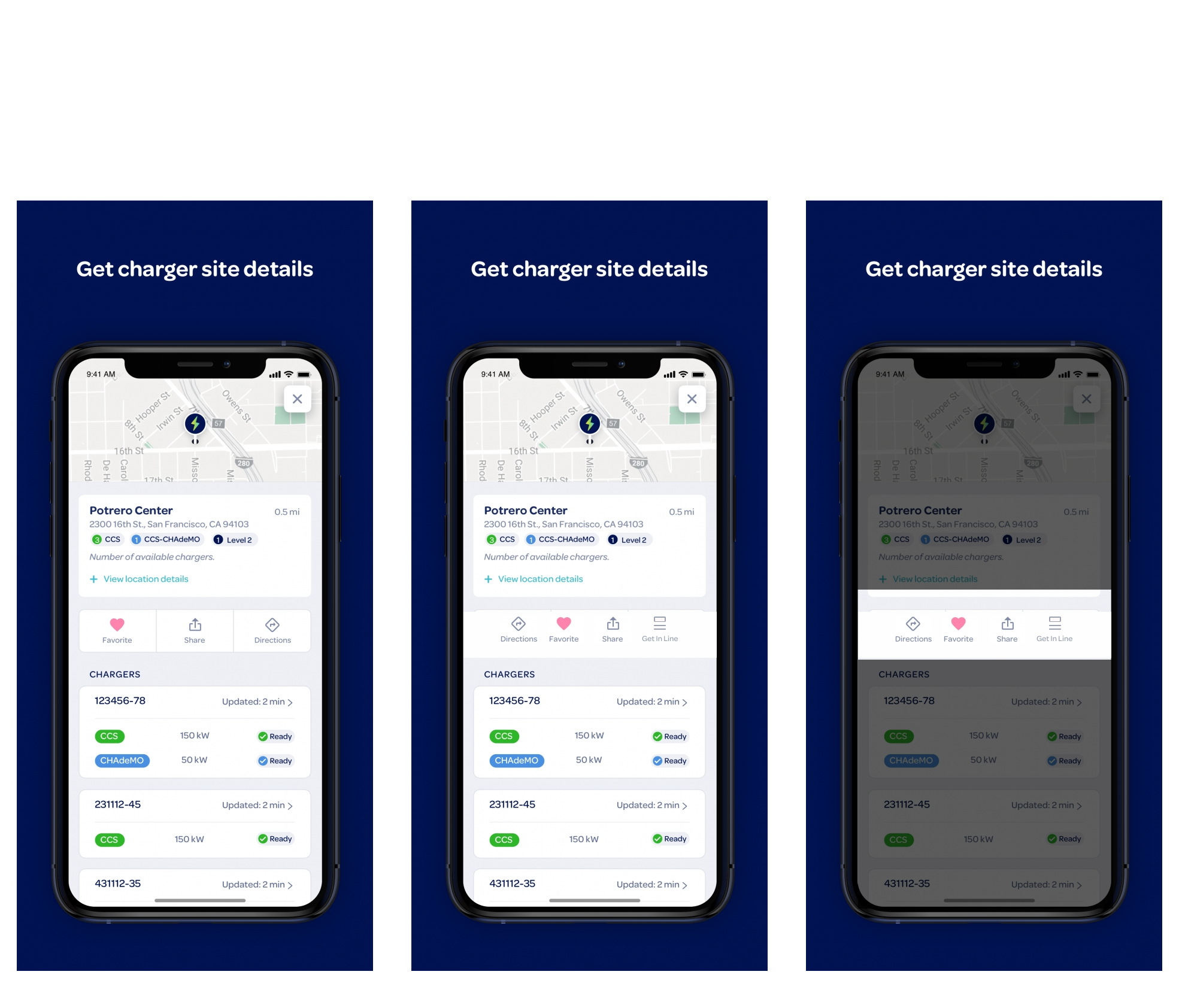
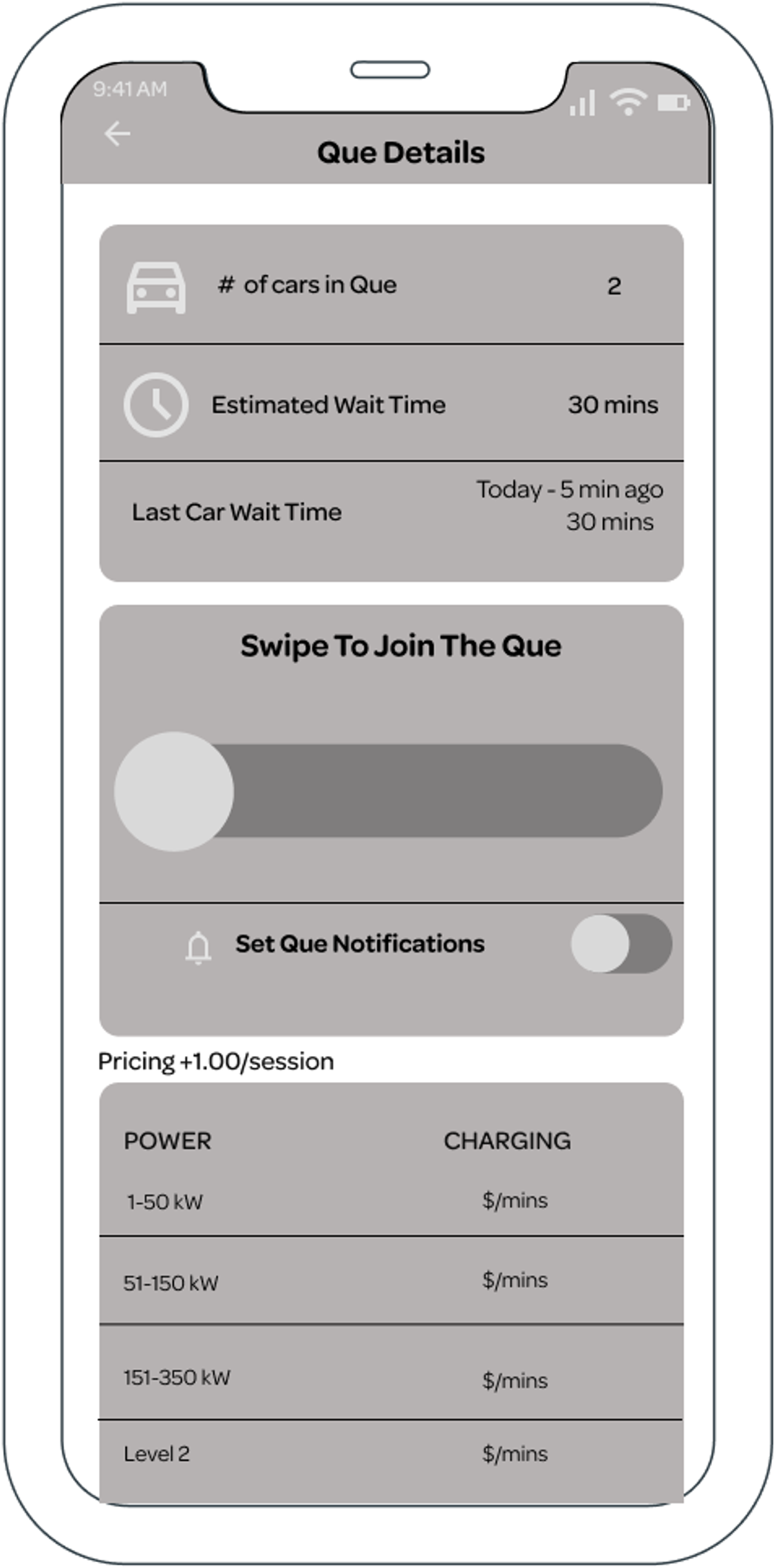
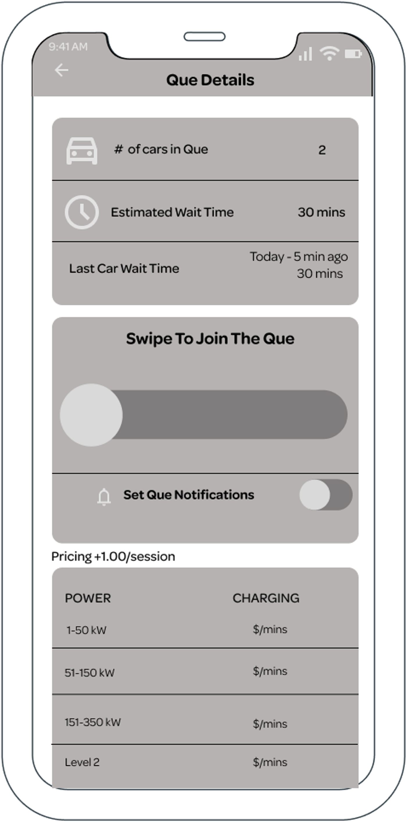
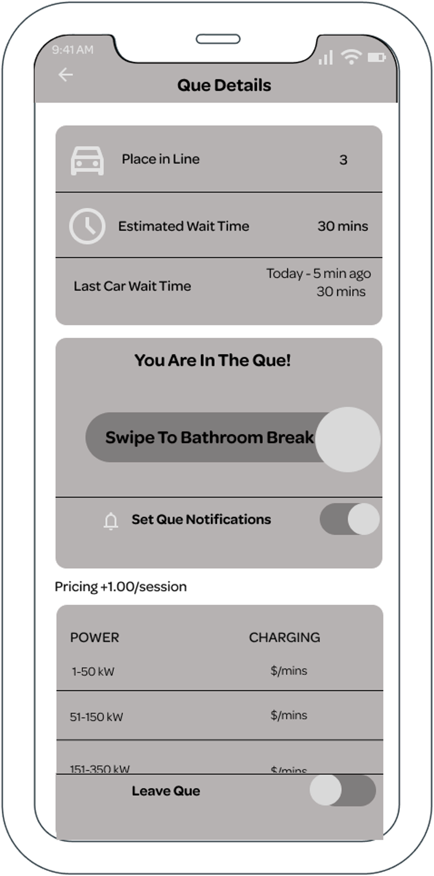
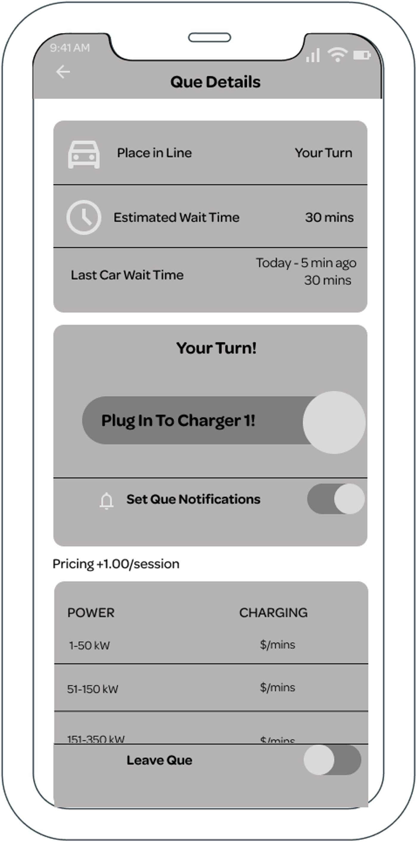
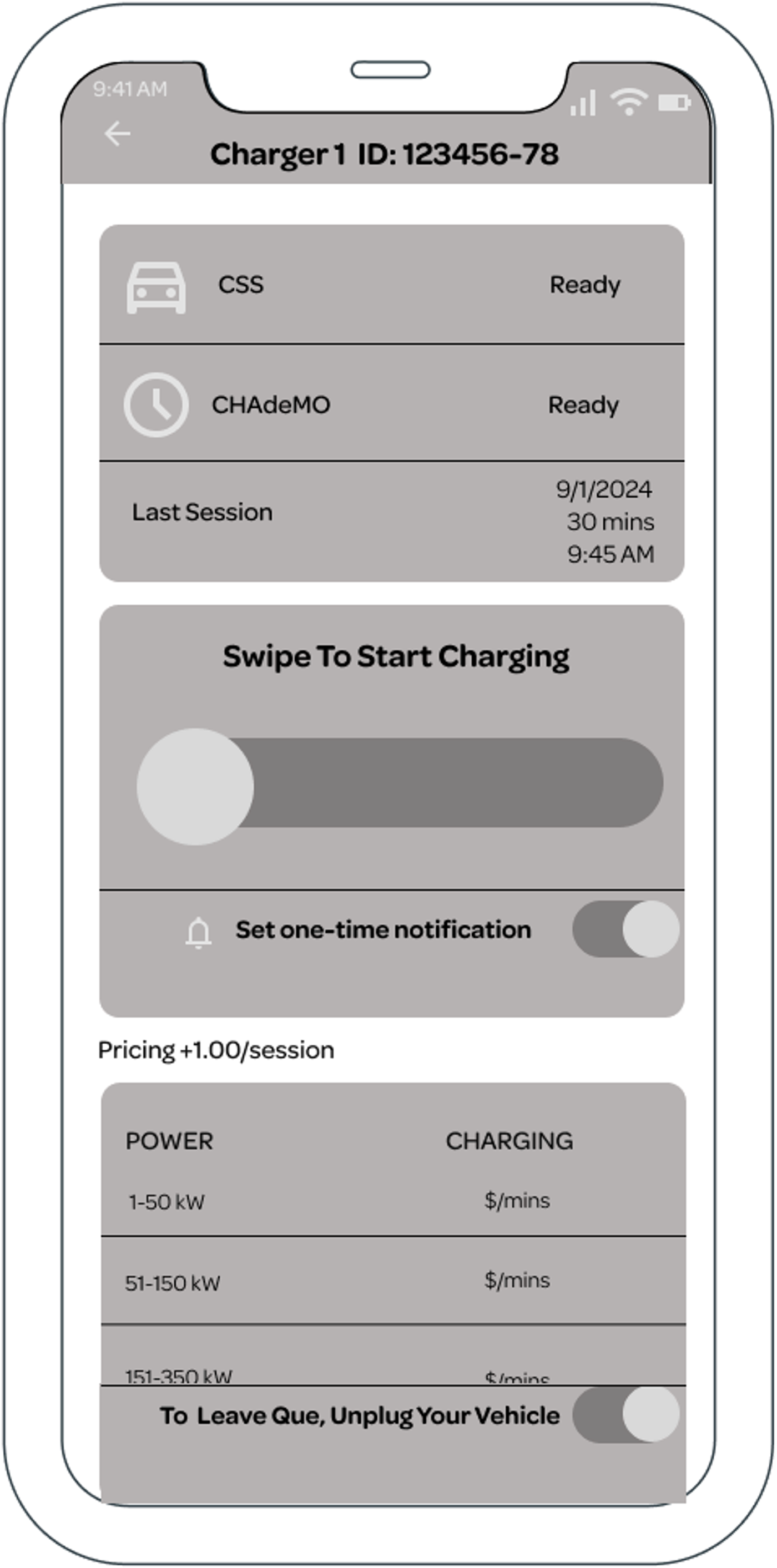
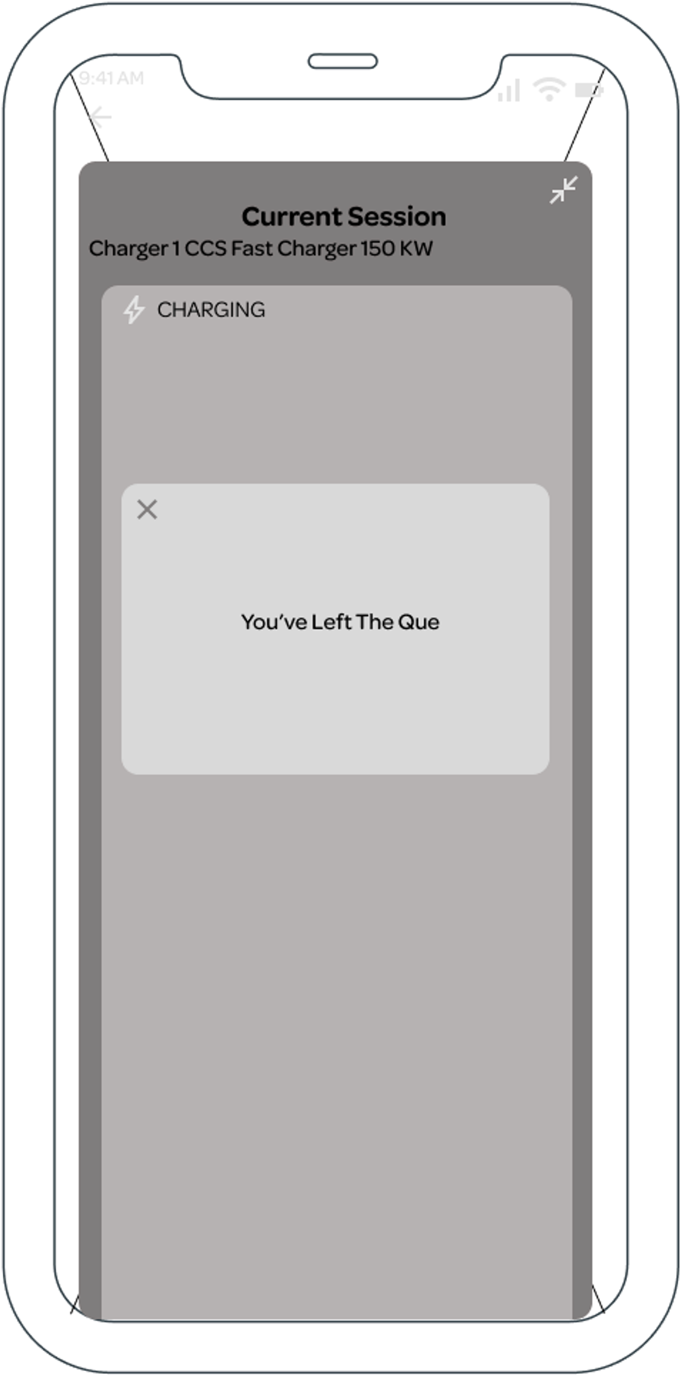
I designed a digital queueing feature for the app, built to feel native to the existing interface.
This is a 2026 prototype in Figma Make
- • Figma
- • FigJam
- • Figma Make (2026 revisit)
Testing results
Design Process & Strategy
On-site research and interviews
I audio-recorded interviews with 16 users over 2 days, split evenly between an EA station and a Tesla competitor station. I used a 20-question open-ended script focused on values, motivations, and daily routines.
I reviewed EA's mission statement, Reddit forums, and the existing app to understand design decisions already in place, before proposing any changes.
Wireframes, design & iconography
I designed queue icons for the mockup from scratch, matching EA's existing visual style and using an industry-standard icon type for lines and queues.

Wireframe was designed to look and feel familiar to users of the app with slight color changes and placement to enhance accessibility.
Scoping and ideation
I evaluated two directions and prioritized based on impact and effort, let's play who's first again:
The winner: A digital in-app queue ensures who was first

The digital queue was the clear choice. High impact and lower effort than building new infrastructure.
On-site usability testing
Rather than building a full Figma prototype first, I tested the user flow concept on site. I asked station users to role-play the queuing scenario, which let me validate critical edge cases, like leaving the queue for a bathroom break, before committing to screen design.
32 usability testing participants took part, including previous interviewees.
Results and next steps
All 32 participants reported feeling less anxious and more satisfied.
- Zero conflicts were observed during testing.
Lasting Community Impact:
Even after the study ended, users continued to spontaneously form a physical queue, confirming the underlying need.
Iterations would include accessibility review of text color and font size, geolocation integration in the queue screen, testing queue positioning within the broader user flow, and a full developer handoff.
*2026 update -> I made a prototype with figma make.
I would also spend more time on icon inspiration for the queueing feature, even though it is an industry standard, I am not the biggest fan of it.
- Helping my community is crazy fun.
- It's cool that I can take wireframes that I made 2 years ago and make a fully functional prototype in minutes with AI.
- Helping the people at this station also helped make this part of the parking lot safer as a whole, nice domino effect of change.
I have audio of interviews and would love to show you how much people loved this, for that you need to contact me.